
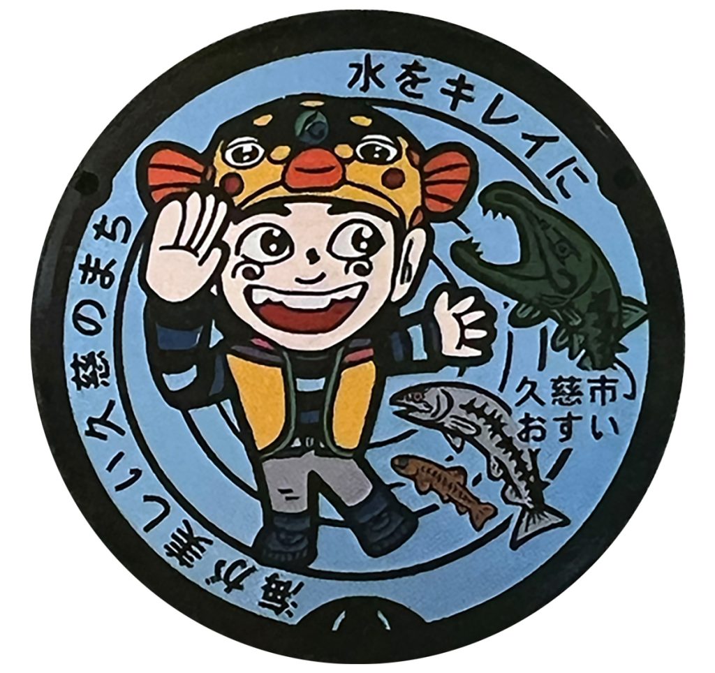
Nobody sets out to make sewer infrastructure beautiful. And yet, sometime in the mid-1980s, a handful of Japanese government officials decided that’s exactly what needed to happen. In doing so, they accidentally created one of the country’s most beloved design phenomena.
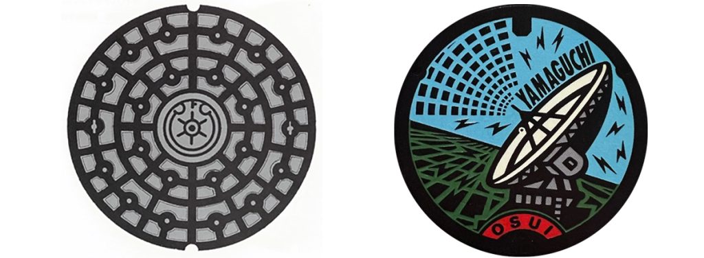
For most of the twentieth century, Japanese manhole covers looked like manhole covers everywhere else. Functional grids. Simple circular patterns. A city crest, if you were lucky. Nobody looked twice. That was the point.
An Idea Born From a PR Problem
In 1986, a Ministry of Construction official named Itaru Nakamoto said something that quietly changed the streets of Japan forever. Sewerage systems, he argued, were expensive, invisible, and hard to get public support for. So if you wanted more of the country connected to modern sanitation, you needed residents to actually feel something about the infrastructure buried under their feet. His idea: make the one visible part — the cover — worth looking at.
Around the same time, a ministry bureaucrat named Yasutake Kameda picked up the idea and ran with it. He recognized that the manhole cover was the single most visible piece of a sewerage system anyone would ever see. He pushed for covers designed around local identity — a town’s history, its industry, its symbols — rather than generic government-issue patterns. His formal proposal, around 1984–85, is generally credited as the spark.
A Competition That Sparked a Nationwide Trend
What happened next is the part that still surprises people. In December 1986, the government ran a nationwide design competition and selected twenty original cover patterns. The following year, a ministry publication called Manhole Cover Expressions showcased eighty more. A popular book by design writer Joji Hayashi added fuel. Manufacturers, sensing a trend, started actively promoting custom designs. Municipalities didn’t want to be the one town stuck with a boring cover while the next town over had something to brag about — so they jumped in fast.
It worked, and not just artistically. Japan’s sewerage penetration rate — the percentage of the country actually connected to modern sanitation — went from 26% in 1977 to 57% by 1997, and eventually to over 96% by 2010. By 2008, roughly 95% of the country’s 1,780 municipalities had adopted a locally themed cover design. A PR strategy aimed at getting people to care about pipes had, almost as a side effect, turned an entire nation’s streets into a quiet, decentralized art gallery.
What’s Actually on These Things
Once cities started designing their own covers, the results got wonderfully specific.
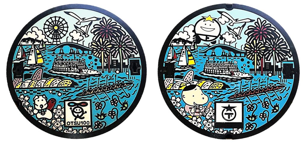
Otsu City, right next to Kyoto, has several designs. Below is the 2015 redesign, made to commemorate the 100th anniversary of the city’s 1898 incorporation. Set against the backdrop of Lake Biwa — Japan’s largest lake — the cover features Otsu City’s official flower, tree, and bird: the Eizan Violet, Yamazakura, and Black-headed Gull. It also shows the steamship called “Michigan.” The vibrant design includes two city mascots, “Otsu Hikaru-kun” and “Hall Manzo.” The fireworks bursting over the lake are inspired by the Lake Biwa Grand Fireworks Festival, a summer tradition in Otsu. The fireworks make the most of Lake Biwa’s setting, and they’re well worth seeing.
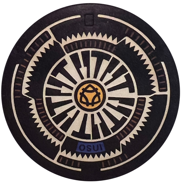
In Miki, a small town in Hyogo Prefecture, the cover tells a different story. The town has a centuries-old reputation for metalworking and woodworking, tracing back to tax exemptions granted after a 16th-century battle. Its cover shows saws, knives, and hammers arranged in tight sets of three — a quiet nod to the first character of the town’s own name, 三木, which literally means “three trees.”
Neither cover explains itself. You just have to know — or have someone tell you.
These covers don’t explain themselves. You just have to know — or have someone tell you.
Why this is more than trivia
What strikes me most, researching this, isn’t the artistry. It’s the intent behind it. A government worked out, decades before “brand storytelling” was a phrase anyone used, that people don’t fall in love with infrastructure. They fall in love with meaning. Give a town’s history a physical form small enough to step on, and people will actually stop, look down, and notice.
That’s the same instinct behind everything I do in the manhole cover workshop: the most overlooked things usually have the richest stories, if you’re willing to look closer.
Want to see this design language up close?
Come print your own piece of it.
This article draws directly from my own peer-reviewed research — if you want to dig deeper

Leave a Reply